My split keyboard layout: A 60% Miryoku
I have a soft spot for 40% keyboard layouts. However, Slovak uses 461 letters, compared to English’s 26, so having them only on layers quite drastically reduces your typing speed. Thus I am stuck with a 60% board… but why not have the best of both worlds?
The layout
I did quite a lot of experimenting with my own layouts, and when I encountered Miryoku, a 36-key layout, I was really impressed with its thought-through design. Its principles were very similar to the things I derived from my own experiences, and it implemented them meticulously.
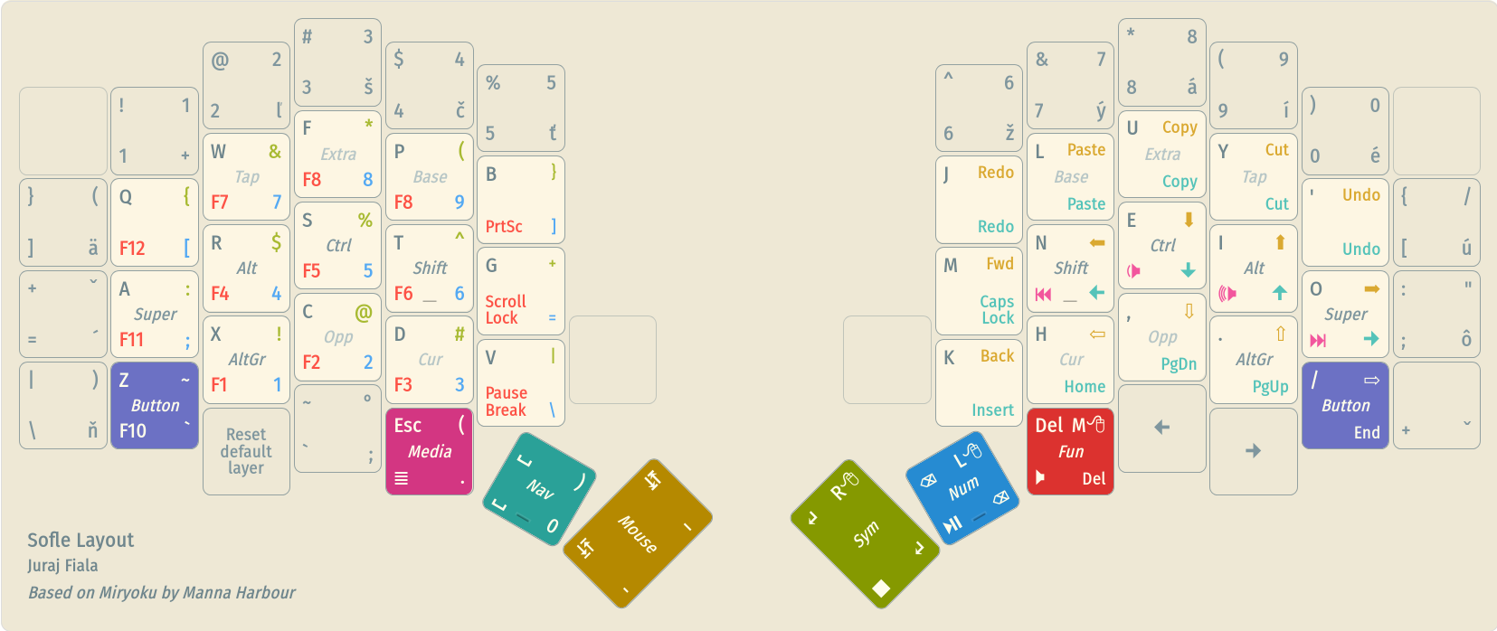
This is my 56-key version of Miryoku on the Sofle keyboard.
The core
The inside is a basically unmodified Miryoku (do not these tiny layouts look cute?).
Overall, I really like the layout. Here are my condensed thoughts on it.
Pros
- Home row mods are awesome. They take some getting used to, but it is worth it. *Chef’s kiss* so comfy
- The thumb cluster is great, I never realised how much I use these keys (especially backspace). They also play well with alt- and ctrl-tabbing, even though it takes a week or two to start tapping them in the correct order
- Also, their dual layer-switching function is really neat; it makes them very powerful
- Colemak-DH will probably need a separate blog post, but any optimised layout is better than QWERTY, so worth it (but not mandatory)
- The pinky button layer makes copy-pasting independent from the layout, which is great
- Easy to learn gradually
- Manages to pack in all the keys, except for the numpad
Cons
- The 200ms mod-tap delay is there. You stop feeling it a bit after a while but it still feels better without it
- Currently I use 240ms on the pinky keys and 160ms on all others.
PERMISSIVE_HOLDhelps a lot to reduce the increased strain
- It’s especially annoying to use with mouse-heavy programs, like graphic design or 3D modelling
- QMK cannot react to mouse presses, so many times you will click before the modifier kicks in
- Because of that
PERMISSIVE_HOLDwill not work either, so you always have to hold them for the full delay, which is quite taxing on the fingers - The tap layer helps, but there is not enough space on a 40% board for the modifiers. I will probably design a custom full-60% layer for that
- Also see the bonus keys section for some workarounds I had to implement
Double-edged swords
- It is heavily based on the American layout
- Pro: Easy to learn
- Cons: Very noticeable on the number and symbol layers, which are not optimised at all. For example, layer-locking the number layer cannot be used with a calculator app or for data input (missing
/,Enter,Backspaceetc.), and the symbol layer does not have all sympols, and they are oddly spaced (like the parantheses, or the common curly brackets)
- It is very space efficient
- Pro: Great for small boards and minimising hand movement
- Cons: There is no space for custom characters, (e.g. I would really like typographic unicode symbols somewhere. I currently use the outer rows and columns on layers but that breaks their semantics a bit). Also uncommon keys like Insert or Pause are a bit too easy to hit
- It is for two-handed usage
- Pro: Very comfortable to use
- Con: Can be awkward to use with a mouse if you need more than just copy-paste
But overall, the best layout I tried so far. I do recommend reading the whole reference manual to learn it more quickly.
Number row
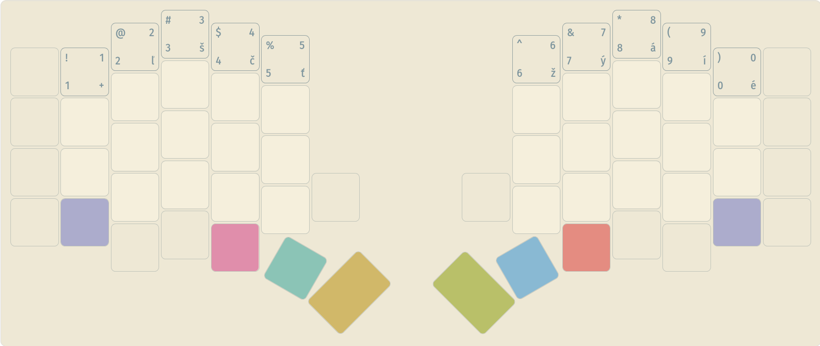
I left it as-is, except for the outermost keys, which are too far away to be useful, and do not contain interesting keys for me anyway. If I need them, I can use them in the Miryoku layers.
I also included the Slovak legends here to give an idea just how important these keys are to me.
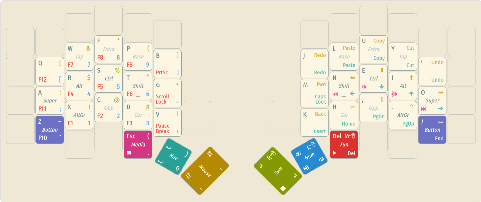
Outer pinky columns
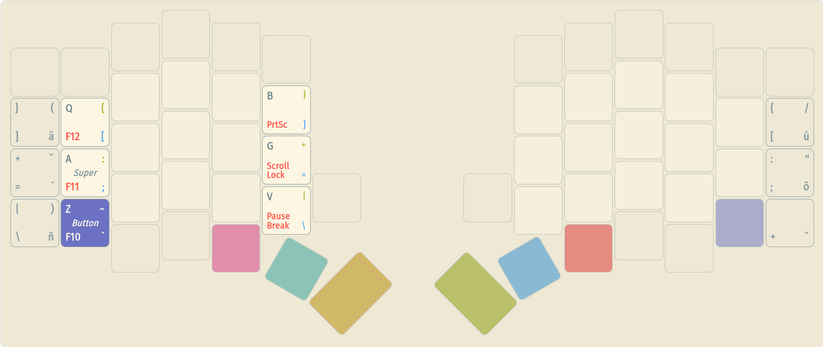
These were the interesting ones. Miryoku already includes an elegant and easy-to-remember solution on the number layer. The left and right columns contain all the leftover keys. The keys that already existed on the three main rows ([, ; and ]2) have their positions unchanged. The three remaining keys are placed arbitrarily, but I found them comfortable to use.
I returned the left column to its original place. The right column then went on the opposite side; this took some getting used to, but I quickly adapted and found it comfortable.
The only change I made was to swap the backtick (a semicolon on the Slovak layout) for a caron dead key (ˇ), which is needed for some of the letters that do not fit, such as ď, or capital letters.
Bonus keys
This leaves us with 4 remaining keys (discounting the two top corner keys, which I only include in my tap/gaming layer) and two encoders.
I just flung whatever I found personally useful there.
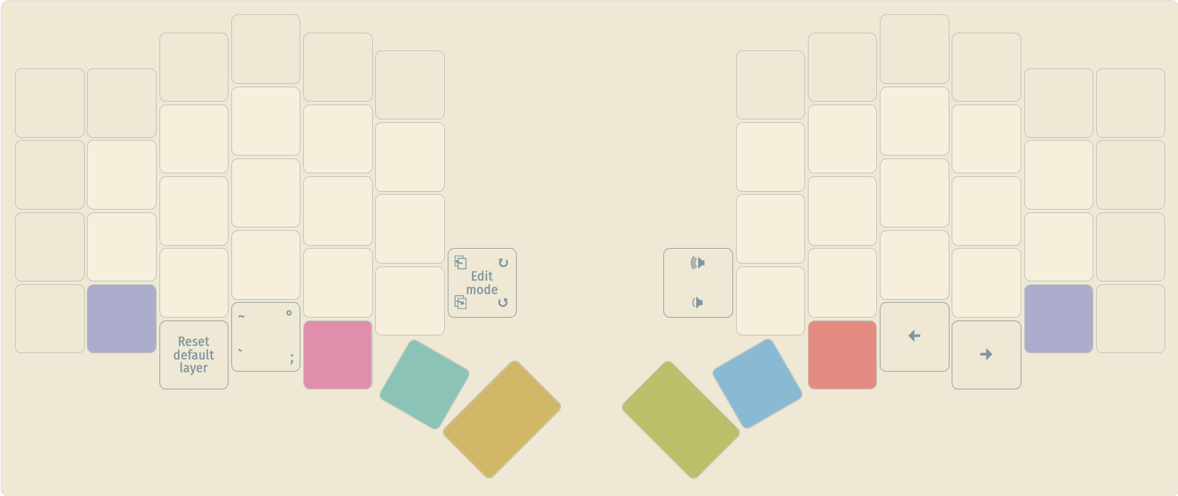
- The bottom left key is for returning from the tap/gaming layer, as Miryoku does not include a key for that. This one is just hard to hit by accident
The next key is the backtick, as GNOME uses it for theI found it’s much better to remapAlt+`same-app window switching shortcut. This is the single most annoying downside of switching to Miryoku, as I cannot figure out an elegant one-handed solution to it; this is my best workaroundAlt+Spaceto switching application windows- I use the analogous keys on the right side for arrows, as I am often lazy to use both hands for rewinding a video
- The encoders are my favourite part.
- The left one is
PageUpandPageDownby default, for quickly scrolling long documents. When pressed, it switches to edit mode, where it scrubs edit history instead (which is a bit awkward in Miryoku with one hand). Both of these are incredibly useful, especially one-handed - The right one is volume control, with play/pause on press. Along with the bottom arrow keys, this covers most of the media controls I need with just one half of the keyboard
- The left one is
I hope you found some of this information useful for designing your own layout.
Sample implementation
You can find the newest version of my keymap on my QMK fork. Since the time of writing, I had made several changes. The core design principle is the same but it has many quality-of-life improvements. You can find the newest visualisation on my Figma!
-
…of which 3 are digraphs (ch, dz, dž), so I guess actually only 43, but how would you call them then? Grapheme clusters? ↩
-
Note that Miryoku swaps the apostrophe and the semicolon ↩
This post is part 1 in a 2-part series on keyboard layouts.
- Part 1 – My split keyboard layout: A 60% Miryoku
- Part 2 – How to implement a bilingual QMK layout for programming (with EurKEY)